
Case study / Data integration & visualization
Course Evaluation Visualizer
Turning static course-evaluation reports into data that can be explored and compared.
I built the backend, data integration and application functionality. The UX and design were created by a colleague.
The problem
Looking across separate reports.
Course evaluation results were primarily available as separate PDF reports. These made individual evaluations readable, but were not well suited to exploratory and comparative analysis across courses and iterations.
It was difficult to compare earlier iterations, multiple courses or broader averages, inspect stronger and weaker areas visually, and explore or filter free-text responses.
The idea
An application for exploring the data.
Bring evaluation data into an application where people can search, filter, select and compare evaluations interactively. Quantitative results and qualitative feedback can then be explored together, beyond the boundaries of individual reports.
Architecture / Data pipeline
A synchronized dataset behind the interface.
Course Evaluation Visualizer / Conceptual data flow
- Survey&Report
Source evaluation data - Scheduled synchronization
Data retrieval and updates through cron - WordPress database on KIT
The local evaluation dataset - Course Evaluation Visualizer
Search, comparison and exploration
A conceptual view of how evaluation data reaches the application.
The application retrieves evaluation data from Survey&Report and stores it in a WordPress database on KIT. Scheduled synchronization keeps the dataset updated for the interactive application.
01 / Find
Finding evaluations.
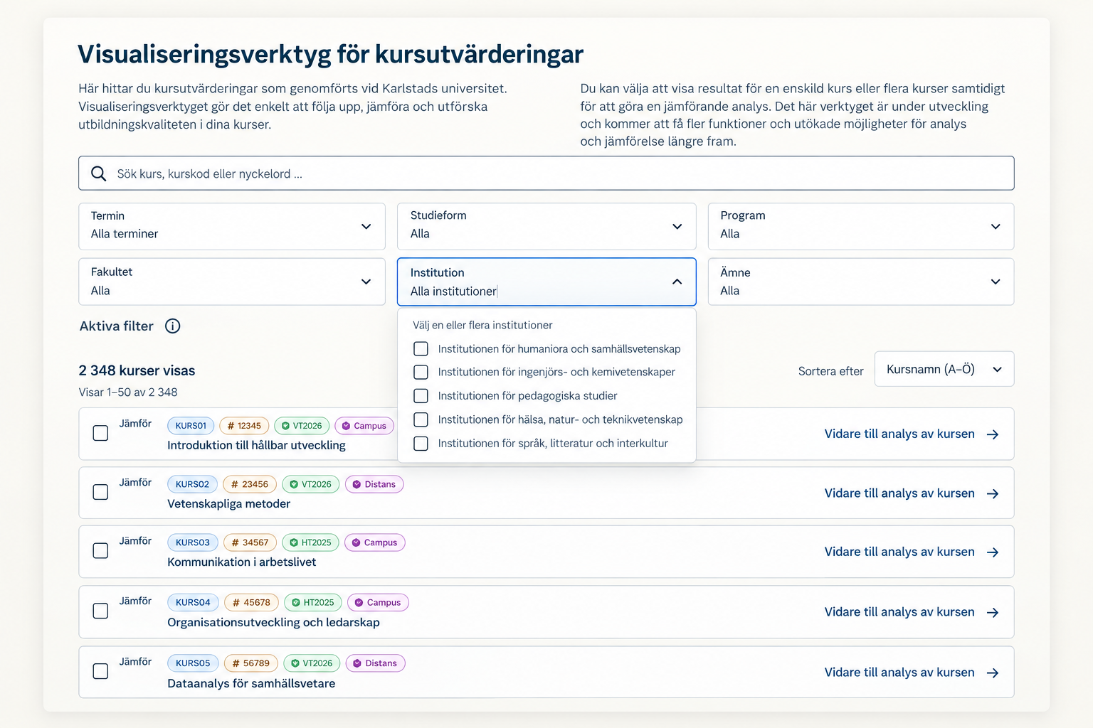
Users can search and filter evaluations by term, study form, programme, faculty, department/institution and subject, narrowing the results to the courses and iterations they want to explore.
02 / Select
Selecting courses.
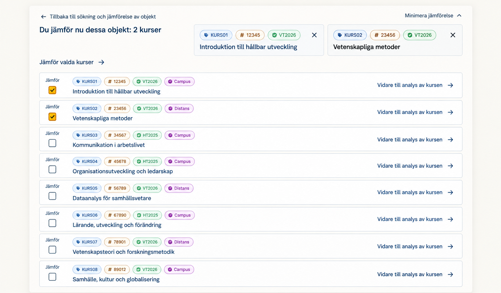
Users can select multiple evaluations to compare iterations of a course or examine several courses together.
03 / Compare
From reports to comparative analysis.
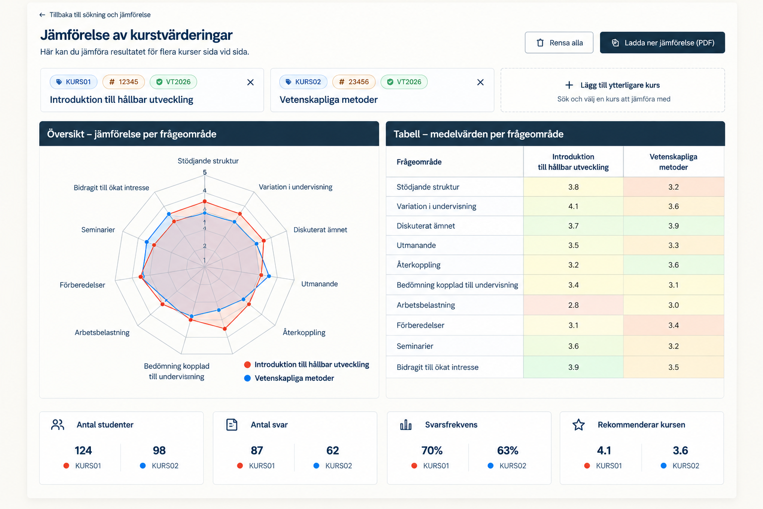
Selected evaluations appear together with student and response counts and recommendation/summary values. The chart and table provide complementary views of the results.
04 / Inspect
Seeing patterns.
The radar chart gives a visual comparison across evaluation dimensions. The table allows a closer reading of the results, helping people inspect how the selected courses differ.
These views support human analysis. Interpretation of educational quality and decisions about what to do next remain with the people reviewing the results.
05 / Explore feedback
Exploring qualitative feedback.
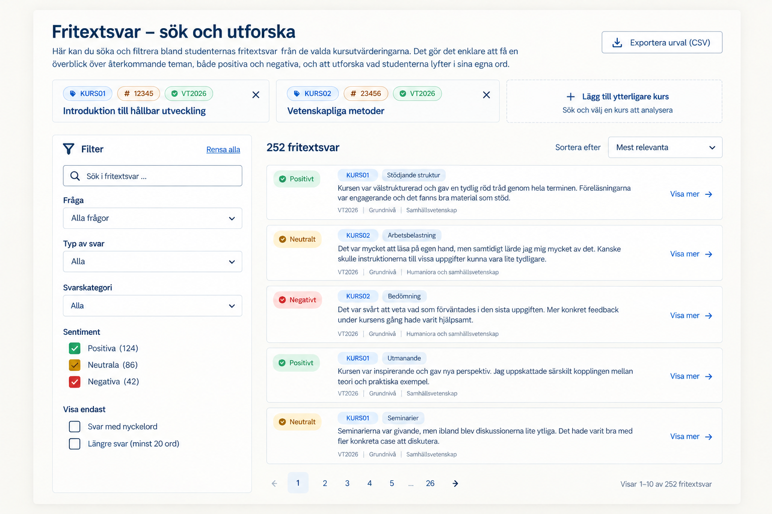
Free-text responses can be searched and filtered, making qualitative feedback easier to explore alongside the quantitative results.
Filters include the question, student/course context and response or satisfaction categories where available. This helps people focus on the feedback relevant to what they are investigating.
What it enables
Evaluation data people can explore.
The system turns data previously consumed mainly as separate static reports into an environment for:
- Finding evaluations
- Comparing course iterations
- Comparing multiple courses
- Identifying patterns across evaluation dimensions
- Exploring free-text feedback